08/20/2020
By Nikhil Rajendran | Reading time 5 mins
By Nikhil Rajendran | Reading time 5 mins
I was recently working with funnel charts for a client’s requirement. While working with it, I realized how flawed and confusing the funnel chart is. Honestly, it made me appreciate the other types of charts a little more!
First of all the name “Funnel” chart itself is incorrect. Based on the name, you would probably assume that the data would be arranged in a descending order. However, that is not the case. We cannot analyze the data by just looking at them because of this. We need to look at the data in a detailed manner. It defeats the whole purpose of a chart for many users who look at them to draw a quick summary.
Based on a recent requirement, I created a funnel chart which showed the “Credit Limit vs Relationship type”. It exhibited how much each Account relationship type contributes as a total to the Credit Limit. This was the result:
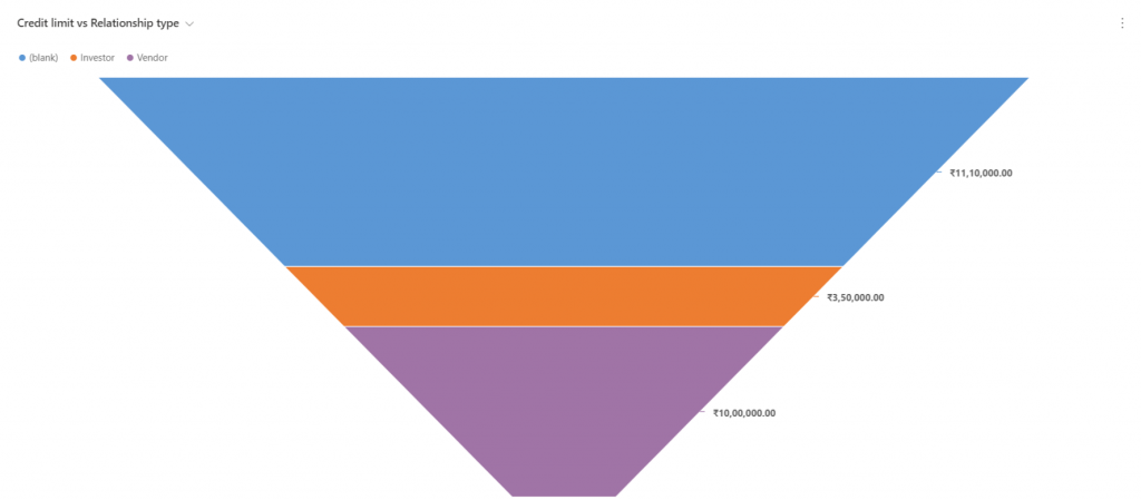
Now, when you look at the chart for the first time, you would assume that the data in the blue color is the highest and the purple is the lowest. Unfortunately, that is not true. In this case, the orange section is the lowest.
The reason for this kind of arrangement is because the data is sorted based on the relationship type and not the credit limit. Wouldn’t it be ideal if it gets sorted by the Credit limit instead of the Relationship type by default?
The way the funnel chart is developed is such that the grouping field needs to be set as the horizontal axis. In this case, the Relationship type. The aggregate field needs to be the vertical axis, the Credit limit here. Therefore, in the chart designer it looks like this:
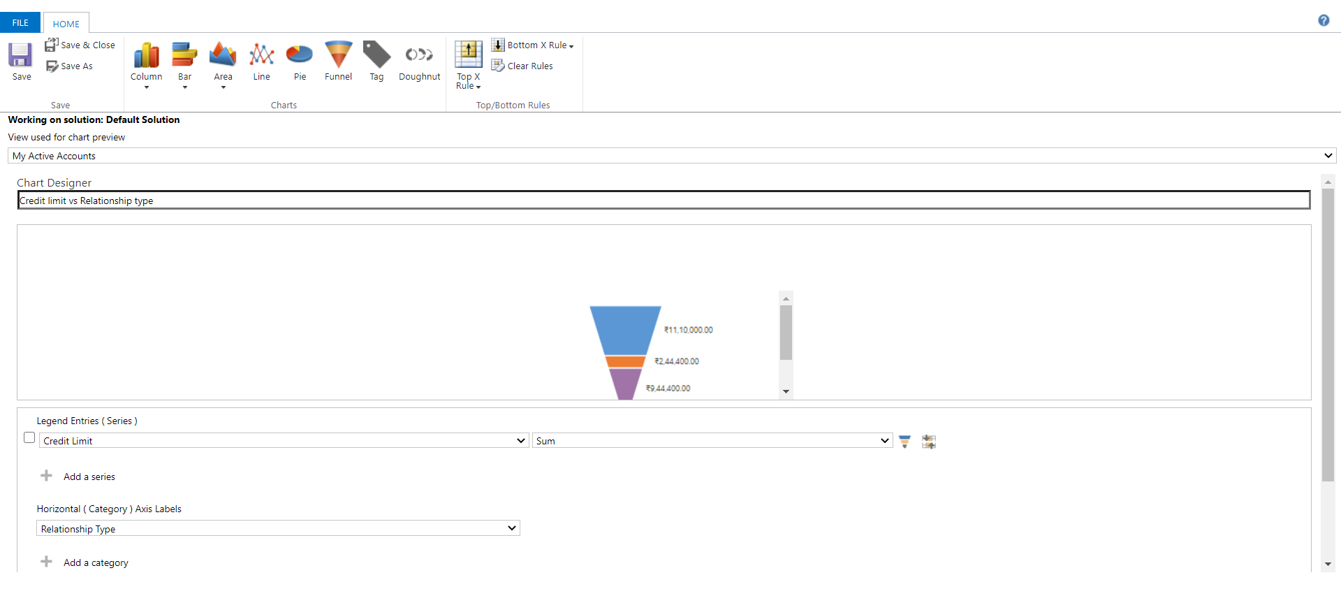
The issue is that we cannot chose the respective sorting field. It is automatically sorted by the horizontal axis field- Relationship Type. We cannot change it to the Credit Limit if we wanted to.
Now we can sort it by the Credit Limit if we wanted to. To do that, we need to export the XML of the chart, modify it and import it back. That is a lot of work and the administrators/business analysts might not have the knowledge on how to do that.
It is recommended to use a different type of chart instead of the funnel chart for the same requirement. Bar and Column charts are a good replacement for the funnel charts. The same requirement when developed using a column chart looks like this:
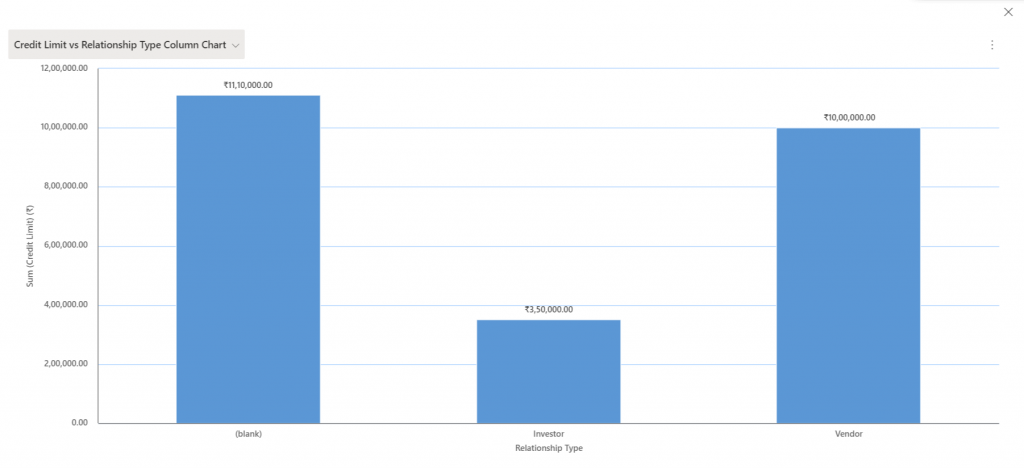
Unlike the funnel chart, you can definitely come to a conclusion by just looking at the above chart. The conclusion is that the accounts with the relationship type as “Investor” has the lowest credit limit and the accounts with no relationship type(blank) has the highest.
There is ample amount of data available to organizations than ever before. There is an upsurge of data, and in order to comprehend it, we need graphs, charts, tables. If your client’s requirement needs the inclusion of a funnel chart, it is advisable to assess the pros and cons of the same. You can avoid a lot of mismanagement and confusion if you understand what works the best for your client.
If you want to know more about Dynamics 365 and the way it can revolutionize your operations, connect with us today.
Nikhil has been with AhaApps since 2017 as a Microsoft Dynamics CRM Developer. He is a driven CRM expert who is ready to fight off the challenges in the Dynamics world with his technical know-how and prowess. He is a sports enthusiast and loves to play tennis when he gets time. He is also a voracious reader and enjoys reading philosophical books.